1. 분석
HTML input tag의 type중 `checkbox`와 `radio`를 커스텀 이미지로 변경해야 하는 경우가 자주 있다.
`checkbox`, `radio`의 보여지는 체크 이미지를 커스텀할때 방법이 CSS, JS등 여러가지 존재하지만 이중 한 번 스타일을 작성해놓으면 HTML tag만 복사해서 재사용 할 수 있는 CSS로 체크박스와 라디오버튼의 이미지 변경하는 방법에 대해 알아본다.
`checkbox`와 `radio`의 커스텀을 위해 CSS와 HTML tag의 속성을 같이 사용해야 하는데, HTML tag중 `label`이라는 tag의 `for` 속성과 `input` tag의 `id` 속성의 관계를 이해하는 것이 중요하다.
1.1. input과 label의 id, for 속성
`input` tag의 `id`속성과 `label` tag의 `for`속성은 서로 같은 값을 갖게 된다면 `label` 클릭시 `input`이 클릭됐을 때와 마찬가지로 `input`의 값(true or false)을 변경시킬 수 있다.

참고: https://developer.mozilla.org/ko/docs/Web/HTML/Element/label
1.2. CSS의 `:checked` 의사 클래스
CSS의 `:checked`라는 의사 클래스는 `input:checked`처럼 선택자가 체크 됐는지(true) 안됐는지(false)에 따라 CSS 속성을 적용시킬 수 있다.
참고: https://developer.mozilla.org/ko/docs/Web/CSS/:checked
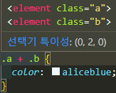
1.3. CSS의 `+` 인접 형제 결합자
인접 형제 결합자는 말 그대로 인접한 형제를 선택하는 CSS 선택자이다. `.a + .b`라고 한다면 `.a`클래스의 인접한(바로 뒤에) `.b`클래스를 가진 요소에 CSS 속성을 적용시킨다.
참고: https://developer.mozilla.org/ko/docs/Web/CSS/Adjacent_sibling_combinator
위와 같은 지식들을 결합해서 아래와 같은 커스텀 체크박스, 라디오 버튼을 만들 수 있다.
1.4. [번외] 구글폰트 아이콘
추가적인 정보로 현재 글에서는 커스텀을 위한 이미지를 다운로드 받아서 `img`태그에 넣어 사용하는 것이 아니라, 구글에서 제공하는 폰트형 아이콘인 구글폰트를 사용했다.
아래 참고 링크를 들어가서 원하는 아이콘을 클릭하면 사이드바가 나타나는데 원한다면 사이드바 아래에 SVG, PNG 파일로 다운로드 받아서 사용 가능하고, 구글폰트를 임포트해서 폰트 속성을 적용할 수 있게 사용하고 싶다면, 아래 이미를 참고하여 순서대로 진행 하면 선택한 아이콘이 렌더링 되는 것을 확인할 수 있다.
1. 원하는 아이콘 클릭
2. 나타난 사이드바에서 <link .../>를 html head에 복사 붙여넣기
3. html tag를 복사 후 body안에 원하는 위치에 붙여넣기
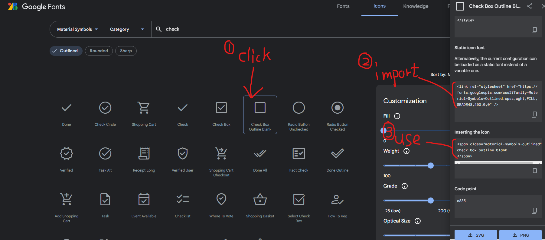
여러 아이콘들을 눌러보면 아이콘을 넣기 위한 예시 HTML 코드를 자세히 살펴보면 tag명은 `span`으로 동일하고, class명은 검색 바 밑의 `Outlined`, `Rounded`, `Sharp`를 체크할 때마다 바뀌고, 아이콘 클릭 시 마다 변경되는 것은 tag 내부의 `text`이다.


글을 작성하면서 위와 같은 규칙이 있다는 것을 알게 돼서 구글폰트 사용에 익숙해지기만 한다면 작업 속도가 오를 것으로 예상한다.
그 이유는 매번 복사 붙일 필요 없이 구글폰트에서 아이콘명만 확인하고 원하는 타입의 아이콘을 넣으면 되기 때문이다.
현재 글의 핵심이 구글폰트가 아니기때문에 추후 조금 더 자세하게 구글폰트 활용법을 글로 작성할 예정이다.
참고: https://fonts.google.com/icons
만약 커스텀 이미지 부분을 구글폰트를 사용하지 않고 img url로 사용하고 싶다면 `<span ...>google fonts</span>`태그 부분을 `<img src="img url" alt="img" />`로 변경해서 커스텀 이미지를 적용시키면 된다.
2. 구현 결과 미리보기
기존 체크박스
커스텀 체크박스
기존 라디오버튼
커스텀 라디오버튼
3. 구현
3.1. HTML
<!DOCTYPE html>
<html lang="en">
  <head>
    <meta charset="UTF-8" />
    <meta http-equiv="X-UA-Compatible" content="IE=edge" />
    <meta name="viewport" content="width=device-width, initial-scale=1.0" />
    <link
      rel="stylesheet"
      href="https://fonts.googleapis.com/css2?family=Material+Symbols+Outlined:opsz,wght,FILL,GRAD@48,400,0,0"
    />
    <title>Document</title>
  </head>
  <body>
    <h2 class="example-ttl">기존 체크박스</h2>
    <div class="example-box">
      <input type="checkbox" id="basic-check-1" checked />
      <input type="checkbox" id="basic-check-2" />
    </div>

    <h2 class="example-ttl">커스텀 체크박스</h2>
    <div class="example-box">
      <div class="checkbox-wrap">
        <input
          class="custom-input"
          type="checkbox"
          id="custom-check-1"
          checked
        />
        <label class="custom-label" for="custom-check-1">
          <span class="material-symbols-outlined custom-label-checked">
            check_box
          </span>
          <span class="material-symbols-outlined custom-label-unchecked">
            check_box_outline_blank
          </span>
        </label>
      </div>
      <div class="checkbox-wrap">
        <input class="custom-input" type="checkbox" id="custom-check-2" />
        <label class="custom-label" for="custom-check-2">
          <span class="material-symbols-outlined custom-label-checked">
            check_box
          </span>
          <span class="material-symbols-outlined custom-label-unchecked">
            check_box_outline_blank
          </span>
        </label>
      </div>
    </div>

    <h2 class="example-ttl">기존 라디오버튼</h2>
    <div class="example-box">
      <input type="radio" name="basic-radio-group" id="basic-radio-1" checked />
      <input type="radio" name="basic-radio-group" id="basic-radio-2" />
    </div>

    <h2 class="example-ttl">커스텀 라디오버튼</h2>
    <div class="example-box">
      <div class="checkbox-wrap">
        <input
          class="custom-input"
          type="radio"
          name="custom-radio-group"
          id="custom-radio-1"
          checked
        />
        <label class="custom-label" for="custom-radio-1">
          <span class="material-symbols-outlined custom-label-checked">
            radio_button_checked
          </span>
          <span class="material-symbols-outlined custom-label-unchecked">
            radio_button_unchecked
          </span>
        </label>
      </div>
      <div class="checkbox-wrap">
        <input
          class="custom-input"
          type="radio"
          name="custom-radio-group"
          id="custom-radio-2"
        />
        <label class="custom-label" for="custom-radio-2">
          <span class="material-symbols-outlined custom-label-checked">
            radio_button_checked
          </span>
          <span class="material-symbols-outlined custom-label-unchecked">
            radio_button_unchecked
          </span>
        </label>
      </div>
    </div>
  </body>
</html>
3.2. CSS
      .example-ttl {
        font-size: 18px;
      }
      .example-box {
        border: 1px solid black;
        padding: 20px;
        display: flex;
      }

      /* 기존 체크박스를 숨기기 위한 코드 */
      .custom-input {
        display: none;
      }
      /* 커스텀 체크박스를 위한 코드 */
      .custom-label .custom-label-checked {
        display: none;
      }
      .custom-input:checked + .custom-label .custom-label-checked {
        display: inline-block;
      }
      .custom-input:checked + .custom-label .custom-label-unchecked {
        display: none;
      }
3.3. JS


